Portfolio 2
A real problematic visualization
As shown below, here's an ugly visualization from r/dataisugly.
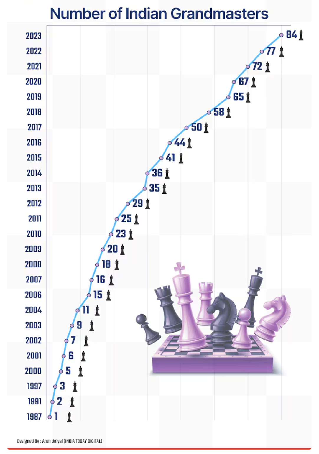
It's trying to visualize the number of Indian Grandmasters over a period from 1987 to 2023. A Grandmaster (GM) in chess is the highest title awarded by the International Chess Federation (FIDE), the game's global governing body. It is a lifetime title, meaning it does not need to be renewed and is valid for the player's lifetime. To become a Grandmaster, a player typically needs to achieve a FIDE rating of at least 2500 at some point in their career. However, the line plot does not do a very good job at visualizing the data. Visualizing the trend of the number of Indian Grandmasters (GMs) from 1987 to 2023 can indeed be challenging with a line plot, especially if the data points are sparse or if the increases in numbers are not uniform year over year. Some limitations of of the above visualization are as follows:
- Discrete Data: The count of Grandmasters per year is discrete data, not continuous. Line plots are more suitable for continuous data where values between the points are meaningful.
- Sparsity: If the data has years with no new Grandmasters followed by bursts of multiple Grandmasters in other years, a line plot might not effectively communicate this pattern. The line might appear jagged and fail to show the significance of clusters.
- Misleading Trends: The line connecting data points might suggest trends that don't exist or obscure important details, such as significant years where multiple Grandmasters were awarded.
Also to add, there are some cases where in which the previous year has more grandmaster's followed by a year with less grandmasters. As the plot aggregates the number of grandmasters every year, it still shows the plot with an increasing trend, which is very misleading.
A Visualization Makeover
Here's a better version in Vega-Lite.
This version of the visualization seems correct to me. Instead of aggregating the number of grandmasters every year, I thought it made more sense to just have the the number of grandmastes for each year in a column chart. This looks more visually appealing. It also has a tooltip to show the number of grandmasters for the highlighted year. We can clearly see the trend over the years by having the visualization like this. I feel there are several reason for this choice:
- Discrete Data Representation: Column charts are well-suited for discrete data points. Each bar represents a distinct year, clearly showing the number of Grandmasters for that particular year. This avoids the misleading implications of continuity that a line chart might introduce.
- Easily Comparable: The height of the bars makes it easy to compare the number of Grandmasters across different years at a glance. You can quickly identify years with higher or lower counts.
- Patterns Over Time: Even though each year is shown discretely, you can still observe trends over time. If there is a general increase or decrease in the number of Grandmasters, it becomes visually evident.
To conclude, by using a column chart, we ensure that the information is accessible and easily digestible, making it an ideal choice for presenting the annual distribution of Indian Grandmasters.